|
I’m Not A Game of Thrones Guy
I could give a rip about Game of Thrones. I’m one of the few people who has never watched a single episode. I’m not living under a rock. I do know it is popular (or was) and there are some really passionate fans.
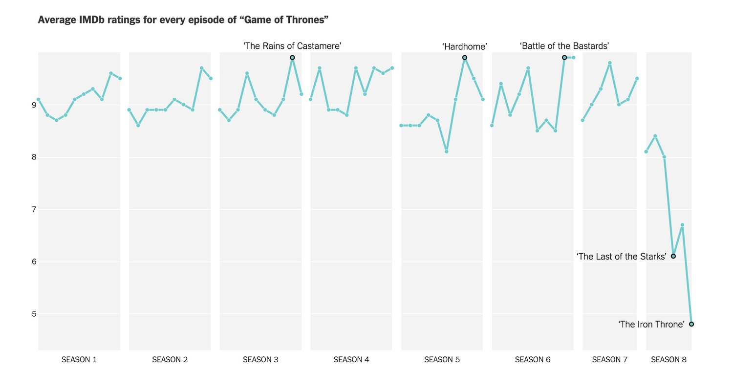
One of my favorite feeds is Cool Infographics and they recently posted Visualizing how Fans Rated the Last Season of Game of Thrones.

First, I appreciate how the post included fan ratings of the last season of other shows. Secondly, I love the visual math landscape of all the infographics. Thirdly, a question I have is what does this say about us as consumers of television? Do we rate something poorly when it’s not what we “expected”? I don’t know. Lastly, I appreciate how the author, Randy Krum, expresses his hesitation about one of the axes. Krum says,
My only hesitation with the choices they made when designing these charts is the y-axis. I appreciate that they kept the scale consistent throughout all of the charts in the article, but the non-zero baseline starting at 4.5 is an odd choice. Non-zero baselines are generally a poor design practice, and can mislead viewers that aren’t paying close attention. It looks like using a non-zero baseline was chosen to maximize the visible differences between the ratings, but on a 0-10 scale, it wouldn’t have been much different with a true zero-baseline.
Krum is using a few of the Standards of Mathematical Practice. Can you identify which ones?
Just like I’m not a Game of Thrones guy, I wonder if we asked Krum about his math experience and if he would say, “I’m not a math guy.” I would beg to differ. My challenge to you all is to question anyone who says, “I’m not a math person.” Rubbish. Don’t let them off the hook. Find out why they said that and join the conversation Tisha Jones and I have been having.
Written by Andrew Stadel (@mr_stadel)
|